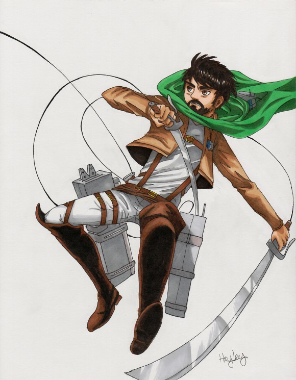
For this post I’d like to talk about movement and fluidity in your artwork. Which encompasses both action and stationary poses, living or inanimate. Many beginner artists seem to forget to add this to their pieces. Of course, it depends on what you’re trying to create—you won’t always use movement. Some abstract pieces for example (although movement is still important there as well).
If you really want your artwork to come alive, movement is important. Otherwise you’ll get stiff or odd looking people and objects. One perfect example is this sketch I did of my husband awhile back:
As you can see almost everything is moving, it’s almost fluid-like. I want to break it down for you (this will simply be a guide to help you envision your art better, so don’t get overwhelmed).
First, I want to point out his center of gravity (the large arrow).
This one is harder to point out a specific center of gravity because the character is literally in motion (not just exhibiting motion). But he’s flying through the air so all the weight is closer to his lower back and butt. He’s also moving in one direction (the smaller arrow). So I had to keep in mind anything (like his cape and hair) that could possibly be pulled backwards from the momentum. To make it more complicated, the amount of lift in his hair and cape would also depend on how fast he was moving and how thin/thick/heavy etc. everything was. But don’t worry about something like that, this isn’t a science class. But remember that with extreme movement like this you will want hair/clothing/whatever to be moving with the same force in the opposite direction that your character is headed. Ok, maybe this is science class.
My next point is probably the most important when it comes to movement. I know clothing is hard for some people so I’ll let you in on something: lines are your best friend. The more the merrier (but don’t go too crazy). As you can see from the arrows, I’ve added lines to simulate the clothing wrinkling from his body’s actions.
Remember to not press too hard when drawing accent lines like these (you shouldn’t be pressing hard anyway). You will want to make quick, light, motions with your utensils. Which should create a tapered looking line that is fatter at one end and shrinks and disappears at the other end. That alone is incredibly important—never ever ever use solid thick lines to show movement. Or it won’t look like it’s in motion. As you can tell from the illustration you’ll want them to go in the direction of whatever is moving. Meaning those quick strokes will start in a place that is the opposite direction of said moving object.
If I’ve confused you, just refer to the picture’s arrows. His body is twisted to the left so the lines are going outwards towards the left. His arm is pointed down and to the left so the strokes point down and to the left. You get the picture (no pun intended).
While I’ve used an extreme example. It’s still a good idea to apply this knowledge to any other painting or sketch you may do to keep your artwork from being rigid, stiff, or unrealistic looking.
Take a look at these other examples that don’t involve an action pose:
Remember to not use solid, thick, lines. So go practice!
If you have any questions feel free to email me (under the About Me section) or leave a comment below.
Thanks for reading!


Great art! The top picture looks like my husband! haha! 🙂