The obvious way to improve your skills as an artist is practice.

But sometimes that’s not enough.

Or maybe you’d like to achieve your personal, artistic, goals a little faster.

In this post I’ll explain how to do this with an easy tactic one of my own art instructors taught me: speed drawing exercises.

The concept is simple. You use an object or a person, or a part of a person (i.e. their face, an ear, a hand, etc.) and draw it as fast and as detailed as you can. I’d recommend using a timer for this.

Cheap_donor_clock_(15384139696)The easy part is you can set the time to be as short or as long as you want. If you’re a beginner, I’d recommend something between 30 to 45 minutes. For everyone else, try no more than 15 minutes. Of course you’re not limited to any of those times, regardless of skill level (and the object you’re drawing may be difficult), but the point is you push yourself. However, there are a few things to keep in mind:

Firstly, don’t push yourself to the point you feel overwhelmed. You’re only trying to improve your skills, it’s not a contest. So pace yourself, but not too much (otherwise it wouldn’t be called ‘speed drawing’).

The second thing to remember is it doesn’t matter the outcome. Your first attempt will probably look kind of messy or unfinished and that’s ok! It will eventually get easier and the faster and the better you’ll be able to draw! I know first hand.

To be honest, I hated these exercises at first myself. But it’s probably one of the many things that I learned that really improved my skills as an artist. Even though I was pretty advanced at the time, my sketching time was practically cut in half by the time the course was over. So it may be annoying at first, but it will really pay off in the long run.


Sketch by William Trost Richards

Sketch by William Trost Richards — This probably wasn’t a timed sketch


I’d suggest doing one once a day. It doesn’t have to be long or complicated, it’s ok to start small. But don’t get so rushed that you halfheartedly slop through it and you end up never improving. If you find yourself doing this, stop. It’s better to not practice at all in this way than to practice bad habits. You’ll just end up hating yourself and hating your art.

However, if you’re serious about really improving your skills, I highly recommend it.

Remember to pay attention to detail and to really observe what you see–given the small amount of time you have. Push your limits and you’ll be surprised at how well you’ll do! You can only get better.


Let me know what you think in the comments or shoot me an email. Don’t forget to keep up with your art challenge!


I wanted to touch on some common mistakes that I’ve noticed some beginners make. Mostly because I used to do a lot of the same things myself. If you find yourself doing some of these things, don’t feel bad. No artist was a master the first time he picked up a pencil (or a brush). Kneaded_eraser

Good art takes time, effort, and a lot of practice. But, you can also practice wrong. The sooner you can recognize bad habits, the sooner you can fix them. Which will either make it easier for you in the long run (your skills will also improve faster).


Be Gentle

I love watching my 10 year old sister-in-law draw. She’s actually quite good for her age, but she has a bad habit of pressing too hard. I think I noticed it only because that’s a common problem for myself still. I’m not so bad at it anymore, but I slip up occasionally.

Why is this so bad? You’re not only creating more stress on your own hand but you’re basically carving into the paper. Which makes it harder to erase mistakes. You don’t want to end up with a piece of artwork that you’re really happy with—only to have a strange and distracting ghost-like image off to one side. Trust me.

How do I fix it? If you find yourself doing this, it’s really a simple fix, just don’t press as hard. Be sure too that you’re not drawing one continuous line or holding the pencil strangely (hold it just like you do when you write). Use short, light, strokes of the pencil. This not only gives you better control over the subject you’re trying to capture on paper, but it leaves plenty of room for error. Also remember, the softer the pencil lead you use, the lighter you need to press (this doesn’t apply when shading). I wouldn’t recommend using anything other than an HB or 2B pencil when doing the first rough sketch though. Stick with the harder and softer leads only when adding details.


No Gaps

Shading has to be one of the most difficult things I’ve noticed for beginners. Honestly, I’m not entirely sure why. If you can color from dark to light, you can shade. Practice makes perfect, of course, but it doesn’t stop there either. A lot of people seem to leave gaps while shading (or go in different directions). Don’t be lazy just because you’re going to blend it later. It actually turns out smoother and cleaner looking if you take the time to color in the shaded areas completely. Then you can blend it. It simply gets rid of the pencil strokes and makes the shadows look more natural. Don’t rely on sloppy shading to get the results you want. I can say the same about shading in different directions, which I mentioned in a previous post.

1024px-Light_through_glass03

 Lighting

The common mistakes made with lighting is different here, than common misunderstanding of the subject. If you haven’t read my previous post on lighting you can here. This part can only really be fixed by fully paying attention to how the scene or object is placed in relation to the source of light. It’s easy to forget where shadows go if you haven’t studied your original set up or don’t have a definite light source. Make sure you really pay attention to what you’re doing. Well, you should anyway. But if shading is a problem for you, it may be because you don’t know where your light source originates. Remember, it’s about training your eyes as well as your hands. I can say the same about perspective.

Study, study, study! I can’t learn it for you.


 Don’t Be Wasteful

Another mistake I commonly see is wasting paint (and art supplies in general). This isn’t always due to lack of artistic skill or knowledge, sometimes you just aren’t prepared. However, the more you are used to using your tools properly, the less likely this is to happen. Sometimes you don’t even know how to prepare for something. It’s perfectly okay to experiment. You’re going to be doing that anyway. My point is to remember to not do it needlessly. If you know what a piece requires don’t be lazy, plan it out.

Paint is most often wasted. If you are working on a painting and you want stop and work on it later, make sure you have some kind of container with an air-tight lid. This way you cover the paint blobs without them drying out. I use something like this. Or, if you’d prefer, you can squirt the paint out onto some foil or plastic and then carefully place the foil (or plastic) into an air-tight container of your choice.


Be Confident!

The most used statements I hear from people (artists and non-artists alike) is: “I wish I was that good” or “I can’t draw a straight line with a ruler” or “______ is the hardest for me, I just can’t do it”. If you want to learn something, then learn it. Ever hear the quote “Every expert in anything was once an amateur”? It’s true.

Also, don’t compare your skills with another artist’s skills. They may have way more experience than you. I can guarantee that every single artist did not start out naturally knowing everything. They learned it from somebody. Some people do have a gift, yes, but it still takes practice and work to get anywhere. You must have confidence in your own abilities, don’t put yourself down. You won’t get any better by giving up or feeling bad about yourself. If art is something you’re passionate about, if it’s what gets you out of bed in the morning, then do it. Work towards your goals.

Lastly, be happy with your own work. If you are not pleased with your own work, and not because you fail to have confidence, then work on the areas you’re not happy with. An art piece you create could look horrible to someone else, but if you’re happy with it, then it doesn’t matter. Celebrate the little accomplishments as well. You finally mastered a certain technique? Does that hand you tried to draw a thousand times look better than last time? Great! Those are the things that keep you motivated.


Now go out there and make good art.

I think the best advice ever given to me was to never use black and white.


Why? Because it takes away from the vibrancy of the color. They dull things. Sure, it’s fine to use black to darken or white to lighten—if you need a specific color.


Now, this isn’t a written-in-stone kind of rule. Or really a rule at all.

Simply good advice.


How can you accomplish this? Pretty simple actually. Just use a lighter color out of the tube.


Need a lighter blue? Get a lighter blue.


Need a darker green? Get a darker green.


Mixing can help as well. If you happen to have a lighter color and a darker color you can mix them together to get the shade you need. As long as they’re the same color, of course.


Now you may be asking: but, you still need white and black for, well, black and white, right? Not really.


Of course you can. It really depends more on what you’re painting. I’ve painted several paintings not using black or white at all. But I’ve also used them on others as well. Plain white paint is definitely a good color to use for extreme highlights. But also not necessary.


I’ve used this before in another example. But this is a painting I did back in college using the same technique I’m teaching you now. It was more of a study on warm vs. cool colors, but it’s still the same idea. For this, I used bright yellow for the strongest highlights and dark blues and purples for the darker parts. Which leads me to another great tip: how to mix your own black paint.


This was (and still is) one of the coolest things I have ever learned. To make black you simply mix dark blue and dark purple together. The darker the original colors are the better. I use “dioxazine purple” and “french ultramarine blue”. These two make a beautiful dark velvety-black color. Of course you can get it to be more blue or purple if you like (and less black) depending on how much of each you mix together. It’s good to test it out first to see if it’s the right amount you need before you start painting.


I prefer mixing my own black instead of using black. However, like I said earlier, there are other circumstances that call for black. But use your own judgment.

This is an unfinished painting that I’ve put off for some time. I’m using this as an example because I used the purple-blue technique for the background. Simply because the dragon is going to be blue. I wanted to stick with the cool blue/purple color scheme. Black would’ve worked here as well, but it wouldn’t have “mingled” as well.
Here, I just used plain black for the background. I believe the purple-blue would’ve worked here too. But I cared less about integrating the background with the rose, since it was the focal point.


Overall, the best way to use this information is to just use your better judgment. Sometimes going color-crazy is the best route for what you’re looking for and other times you might need it to look washed-out and dull.


As always, I hope this little tid-bit of information was helpful to you. Be sure to check me out on facebook, Hayley Boothe Art.


Happy arts-ing!

Since my last post was talking about the difference in paints. I wanted to touch on how to properly mix them. With that said, there isn’t really a “proper” way to mix them, it’s more about knowing what to mix together.


If you’ll recall in my color theory post, I mention warm vs. cool colors. It’s good to know about them so you don’t get the wrong colors mixed together and end up with an ugly color.


I can’t tell you how to set up your painting area, but I can tell you how to select your paints. To do this it’s more about sight and knowing what you’re looking at. (Yes I will drill this into your head.) Before you even begin to paint you must pick out your color scheme. It doesn’t matter what you’re painting, or how it’s going to look, but knowing what you’re going to be doing. Always plan ahead. Good life lesson too, no?

I love Georgia O’Keeffe paintings, so I’ll use this one as an example. The main color scheme here is obviously blue, although not monochromatic (analogous). Just looking at this you can probably tell she used 2 different kinds of blue, black, orange, yellow, and white. Maybe some more, maybe some less, but you get the picture. If you are painting from real life, or from a photo, it’s always good to study your subject first. If only to understand what colors you would be working with. Not only that, but to decide whether you need warm colors or cool colors. Here, obviously it’s mostly cool colors—being blue. But also remember that not all cool colors are considered cool and vice versa.


Take yellow ochre as an example.

This image makes it look a little warmer that it actually is (or maybe that’s just my monitor). But I never use this particular yellow in warm color schemes. It simply doesn’t mix well.


You may never know whether a particular color is warm or cool by just looking at it either. Sometimes you just have to try it out. Be sure to test it out on a palette first. Don’t immediately start painting with it! Also, don’t be afraid of wasting paint (but don’t excessively use it either).

Happy painting!


I apologize again for not posting as consistently as I should be. I hoped to publish something once a week at least but the holidays threw me off a bit. Anyway, I wanted to go over the different types of paints and how to clean up brushes properly. As well as some tools. I’ll put links at the end of the post so you can check them out.

Oil Paint
Oil paint, as you might guess, is oil-based. Unlike acrylic and watercolor paint that are water-based. This type of paint is probably the hardest to clean out of brushes (and clothing or other fabrics). Although, it’s manageable with just about any grease-cutting soap or paint thinner. I personally prefer using a bar of soap (I use Lava brand soap) to have a surface to rub the brush on.
It’s also the paint that takes the longest to dry (up to a week sometimes). If you don’t thin it out that is. If you want to thin it out you can either use, a teeny tiny amount of paint thinner mixed with the oil paint, or Liquin. (Which you can buy at any craft store in the paint section.) Always wash your brushes after using liquin. If you don’t, it will harden the bristles and the brush will be unusable. Maslo_maslo

I want to mention that when you clean your brush NEVER mash the bristles. You will ruin the brush. Always swipe up and down, like you’re painting. Think of the Karate Kid painting the fence “up and down”. If you have liquid soap, you can rub the brush against your palm, or any other bumpy/textured surface. Just make sure the surface isn’t too rough or coarse or you could also ruin the brush. 
Another useful tool is a brush cleaning jar. You can pick one up at your local craft store, or even make one. It’s simply a glass jar with a wire coil or wire mesh inside. You fill it with water or paint thinner and rub the brush on the wire inside. I generally only use this for in-between washes while painting, but it’s still a good way to clean the brush.


Acrylic Paint and Watercolor Paint
Acrylic and watercolor paint are water-based paints. They are the easiest to clean out of paintbrushes. And well, just about anything really. Just rinse well with water and add a dab of soap if it’s stubborn. Again, don’t mash the brush while cleaning. 
1024px-Gouache
I also want to add that if you buy acrylic paint and/or watercolor paint in a tube (AKA the “professional” kind of paint) that they are virtually the same. If you want to use watercolor like acrylic paint, simply don’t add water. If you want to use acrylic as watercolor, just add water. This can save you a lot of money in the long run.

Don’t be concerned if your paintbrushes stain either, the important thing is to see that no excess paint is coming off of the brush. I always dab mine on a paper towel and, if the water comes off clear, then I know I’m done cleaning the brush.


Happy Arts-ing!

I was going to move on to the subject of painting in this post. But I felt I should talk about another basic concept, Color Theory. The main reason I want to talk about it is because I’m surprised at the amount of people that have no idea, not only what a color wheel is, but what two colors mixed together make another color. So I’d like to touch base on this first before I move on. I’m pretty excited actually, this was one of my favorite things to learn in art class. So, who’s ready for a crash course?
256px-BYR_color_wheel.svg
 
As you can see from the picture above, this is your basic color wheel. I’m going to focus on separate color categories at a time. But first, some vocabulary:
Hue: A fancy word for “color”.
Tint: Any color that has white added to it.
Shade: Any color that has black added to it.
Analogous: Any grouping of colors that are similar.
 
First up are the primary colors. Red, yellow, and blue. These 3 colors are important because these 3 mixed together can make up literally every other color of the rainbow. You cannot mix anything together to get these, they simply exist.
Next are the secondary colors. Orange, green, and purple. These 3 are from mixing the primary colors together.
 
Then there are the tertiary (or intermediate) colors. These are created when you mix the secondary and primary colors together.
 
Now you have a complete color wheel!
Except, there’s a little bit more to it than just a colorful wheel. Honestly though, if you only knew the above information, that’d be all you’d need to be an artist. 
Well, at least to get started.
 
Most of the information I’m going to tell you is just a good thing to keep in mind when creating. It can really help make a picture outstanding and grab the audience’s attention. I’ve explained the main 3 color categories, excluding complimentary colors. Which, like I said, implemented properly, can really create some phenomenal art. And guess what? It’s really not even that complicated!
  
 Complimentary colors are colors that are across from each other on the color wheel. Purple and yellow, blue and orange, red and green, etc.
 
Really, it’s that simple. 
 
This is one of my complementary study paintings I did while in college. As you can see, it uses red and green. 
On a side note, you should also know that when complementary colors are mixed together they create either gray or brown. Of course, this only works if the paints you’re mixing together are pure and don’t have other pigments in them. Which may not be noticeable to you, even if the tube just says “red” or “blue”.
 
I would like to also add another important aspect of using color. Which is simply knowing the difference between warm and cool colors.
Basically you split the color wheel in half.
 
Warm colors include: red-violet, red, red-orange, orange, yellow-orange, and yellow.
Cool colors include: purple (or violet), blue-violet, blue, blue-green, green, and yellow-green.
Here is a painting that I did implementing the warm and cool color scheme:
The cool colors are dark and deep, pulling you in. While the warm colors are not only bright, but pop out as well. Thus creating a sense of depth between the two.
I’ll go ahead and tell you that it’s a good idea to stick with a completely warm or cool color scheme while painting—at least when mixing your colors together. Otherwise, you might get some funky looking colors and you’re left wondering how yellow and red mixed together could make a mucky brown-grey color. (When you’ve actually unknowningly mixed together a yellow-green and an orangey-red.) It can be tricky sometimes, especially with the weird color names. You may not know just by looking at it.
And yes, I know this from personal experience.


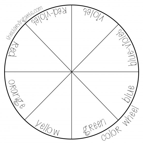
Want to practice your colors? Here’s a few blank templates to mix colors! Use any medium you’d like.
colorwheel

The last important aspect you’ll want to know for grasping the basics is a thing called perspective, or proportions. I’ll show you a simple exercise too to go along with it in this post. Hooray exercises. They do you good. Which reminds me I need to go to the gym. 
This post will be fairly short simply because there’s not a lot to talk about—not because I need to go to the gym.
 
Perspective is important, not only when painting or drawing something like a landscape, but also with portraits. It’s something you see every day and probably don’t realize it (unless you’ve taken my advice and been observing the world around you lately).
Komehakubutsukan-passage
 
In this example, it’s not something you really need to practice over and over (unless you want to), but it is important to understand.You’ll end up “practicing” it anyway.
Basically, the closer an object is to you the bigger it will be and the further away an object is, the smaller it will be.
Hendaye_école_de_surf_2012

There’s not much to say on this topic so I’ll jump right in to the example. We’re going to be drawing a “one point perspective”. You’ll need a pencil or pen, a ruler, and some paper. (Why this picture uploaded sideways on here I don’t know…)

Start by drawing a dot in the center of the paper (I drew mine kind of large) called the “vanishing point”, and then draw angled lines that intersect at that dot:
 
Note: I forgot to add in the “horizon line” (which is exactly what it sounds like). You’ll want to draw a straight line across the paper using your ruler after drawing the dot and THEN moving on to the next step.

Like this:

Now draw the lines:

 The finished product should look like this (just pretend I drew the horizon line).
 
  Note: They can be at any angle, I just drew mine like this.
 
Then draw lines perpendicular to the lines you just drew, like this:
 
After that, you simply mirror the bottom lines on the top. It should look like a big bow. Don’t worry about having them the exact same angle, or if it’s crooked or something. Precision isn’t important right now.


Now here comes the fun part, you can add any details you’d like. Just remember that any object closest to you will be the largest, and the further away it is, the smaller it will be. In my case, I just drew lines which get farther apart the closer they are to you (the viewer). You can draw anything you’d like.
 
Here’s another example (the perspective isn’t quite so distant):


This is the best way I can explain it. If you take the time to observe whatever it is you’re drawing or painting, you’ll automatically know this. It’s probably one of the simplest things to learn when you’re a novice. This was a fun doodle to draw when I was a kid, because I could make just about anything with it. Rooms, streets, tunnels, etc. Just have fun with it!

Want some homework? Do research on some perspective drawings other people have done. Try a Google search, you’ll find some pretty nifty sketches. 

Before I end this post I’d like to let you know that I’ve kept this kind of watered down because I want you to be able to envision it first. If you’d like a more detailed lesson on this, or anything else, just let me know in the comments!

Now I want to talk about how important shading and light is to sketching and, well, just about anything really. Not just sketching. This is probably going to be one of the most important blog posts you’ll read on here.

I’ll give you another exercise, a simple one, that I learned myself at a young age. Remember studying objects? You’ll need to do that again. Actually you’ll always need to do that.

If you were intimidated at all with the photo I posted in the previous post (or intimidated at all with getting started), this is the thing for you. I’m going to attempt to explain to you how to understand the shapes you are observing and studying in the world around you. As well as to focus on lighting and light sources.

First, try really simple shading (if you’ve never done this before you’ll need to learn this first). Take your pencil (any pencil) and start drawing on some paper. Start by pressing firmly (not too firmly or you’ll break the pencil lead) and, moving in a sweeping, back and forth motion (like coloring with crayons), gradually lessen the pressure as you go across the page. It should look something like this:


You’ve successfully learned shading! Yay! Remember to practice this first until you feel comfortable with it. Note: Don’t go back and forth in different directions. Try to keep the motion going in one direction or it’ll look messy.


Don’t make it uniform either, make sure you’re going from dark to light (or light to dark).


Now that we’ve got that down, here’s a simple exercise to help you apply what you just learned:


Simply draw the shapes above in the picture, like I did. If you feel more comfortable using a ruler you can. They don’t need to look perfect. Then add this:


That is your “lamp”. Now, the placement doesn’t really matter (or what it looks like), but, to save yourself some confusion, you may want to place it exactly how I did in this example.


The lines I just drew represent the light coming from the lamp.

Next, you’ll need to add shadows to each shape.


Now this is where it can get complicated. You’ll need to place them based on where the light source is. You’ll want to place the darkest shadows on the opposite side (for my example it’s the bottom right). Then, gradually make it lighter all the way towards the source of light. Remember to wrap the shadows around the shape of the object. For example, the sphere is not flat, so don’t use straight lines while shading—make them curved.

Need a better visual? Set up a real life example of this using a lamp or a flashlight you have around the house. Place random objects under the light and observe where the shadows are.

If you want to get real advanced, take into account the texture of the object too. Is it shiny? Does it have a matte surface? These will all reflect light differently. In addition, the height of an object, as well as the placement of the light source, will have an effect on the shadow the object casts.


Clear as mud? Great. You’ll want to practice this quite often. Take note that you won’t actually draw a lamp in every sketch. But for practice, if it helps you visualize where the light source is, feel free to draw it.


You must not only be comfortable with light and shadows and shading, they must become second nature to you. It’s vital to just about any medium and subject of artwork. You can apply this with what I said in my last post about drawing what you see.

Remember to keep yourself motivated, this takes a lot of patience and perseverance. I’ve known several people who took one look at this example and immediately were put off by it. Don’t give up! If you are genuinely eager to learn, you’ll be able to do it.
Stay tuned for more next week!


This will probably be one of my harder blog posts, since it will be a little hard to convey what I need to say. Although it should be pretty self-explanatory.
You’d think that just about anybody could draw what they see… there just seems to be a disconnect between the hand and the brain sometimes. Which is understandable. Art, like anything, you need training to not only be successful, but to know how to get started. You don’t always need a talent for it. Anybody can learn how if they truly desire it.
However, art isn’t like a sport. I can’t tell you how hard to hit or how many push ups you need to do in order to score points. Art is tangible, but it’s also an idea—a vision, if you will—that can’t exactly be taught.
With that in mind, you’ll need to figure some things out on your own. Style, for example. Anyway, I want to start with a visual example first:
 
Take a good look at the picture. I mean really look at it. Examine every detail. The light, the color, the texture, the placement. Everything.
 
Got it? Good.
Now draw it.
 
It’s not easy at first, it might come out looking like some spaghetti on top of a blob. So what? When you first start, it’s not about the finished product. You’re still learning to walk—so to speak.
 
One thing I might point out that helps me is to think about the object abstractly. In other words, don’t look at the picture as a whole when you draw (although you should before you start). Start by focusing on one leaf and think of it as just a plain shape—not a leaf—and then draw that. It kind of looks like a long skinny triangle, right? Then, add details. Build from that and before you know it you have a cactus plant in a pot on a windowsill.
 
It’s about training your eyes and your hands to work together. That’s the important foundation. If you can’t really look at something, how can you capture it?
 
Go take a walk, observe plants, animals, cars, people, whatever! You don’t even need to draw them (although I’d recommend it). Start by wrapping your mind around what your world looks like!
 
Stay tuned for more and thanks for reading 🙂

Erasers
On the topic of pencils, I’ll talk a little about erasers.If you really want to get into sketching, I’d recommend spending a little extra money and investing in a few good erasers. I would not recommend using erasers on the end of pencils. Since they have a tendency to smudge and leave ugly marks on the paper. Aside from that, you may have to test out several different kinds and brands of erasers to find what works best for you. I personally use plastic erasers for erasing medium to large areas and stick (AKA retractable) erasers for everything else. Plain rubber erasers seem to work well too.
Another important eraser I’d like to mention is called a kneaded eraser. You kind find these online and in any art/craft store. They’re generally gray. The cool thing about these babies is that you can mold and shape them into anything. This is great for erasing very small, intricate areas, or for lightening dark areas. I seriously don’t know what I’d do without this eraser. I highly recommend getting one if you want realistic looking sketches.


Paintbrushes
Paintbrushes are a little broader subject because there are so many different kinds and each one can do a different thing. I won’t go into detail about each one, but most brushes are self-explanatory. If it’s large, it covers a large area, so you can do broad strokes. If it’s medium it does medium strokes. If it’s small… you get the idea. If you’re still not sure, most packaging will explain to you what it does.
Of course, the shape of the brush can make a difference in your strokes as well. I’ve personally never really paid much attention to the shape of the brush when I’m buying one. It’s really more about personal preference and what you’re comfortable with using. I will use rounded brushes interchangeably with square, flat brushes when I’m painting large areas, for example. I only really care about the shape, or type, of brush when I’m adding details. For example, a good brush to use to smooth the brush strokes (and to help with blending) is a fan brush. If you’ve ever browsed the paintbrush section at a craft store you’ve probably seen one and wondered, “Huh, that’s unusual looking, I wonder what it’s for?” Well now you know.
I won’t get into detail about painting techniques, or how to clean your brush, right now. I’m saving that for another day. But I do want to tell you the secret of finding a good quality brush. Paintbrushes are something you don’t want to go cheap with. I’m not saying that all expensive brushes are good and all cheap ones are bad, or even that you have to seek out the most expensive brush (although it would still be a good investment). But, most super cheap brushes that I’ve used are horrible. Bristles will fall out and they’re usually too soft and flexible.
The secret to finding a good brush is to run it through a couple of short tests. The first step is to simply hold the brush in one hand and then place the bristles between two fingers of your other hand. Secondly, very gently, but firmly, squeeze and pull from the base of the bristles (where they are attached to the handle), to the top. Do this a few times and if any bristles fall out, don’t buy it.

The second test is to simply bend the bristles back (whether you’re using the palm of your hand or a finger, it doesn’t matter). If they give the right amount of resistance, they should stand back up straight instantly when you let go. Generally you can feel the resistance while you’re bending it too. If it feels floppy, or bends too easily, don’t buy it.

Of course, this may be difficult to do if the brush is in an enclosed package. In that case you will have to go by sight. If it looks frayed or frizzy in any way, don’t buy it. Most cheaply made brushes will look frizzy, that I’ve noticed. That’s not always true of course, sometimes you may not know until you use it. I also want to add that there isn’t really a difference in artificial, plastic bristles and real hair bristles. It’s solely a personal preference.
Leave a comment below and let me know if you have any questions. Thanks for reading!