I was going to move on to the subject of painting in this post. But I felt I should talk about another basic concept, Color Theory. The main reason I want to talk about it is because I’m surprised at the amount of people that have no idea, not only what a color wheel is, but what two colors mixed together make another color. So I’d like to touch base on this first before I move on. I’m pretty excited actually, this was one of my favorite things to learn in art class. So, who’s ready for a crash course?
256px-BYR_color_wheel.svg
 
As you can see from the picture above, this is your basic color wheel. I’m going to focus on separate color categories at a time. But first, some vocabulary:
Hue: A fancy word for “color”.
Tint: Any color that has white added to it.
Shade: Any color that has black added to it.
Analogous: Any grouping of colors that are similar.
 
First up are the primary colors. Red, yellow, and blue. These 3 colors are important because these 3 mixed together can make up literally every other color of the rainbow. You cannot mix anything together to get these, they simply exist.
Next are the secondary colors. Orange, green, and purple. These 3 are from mixing the primary colors together.
 
Then there are the tertiary (or intermediate) colors. These are created when you mix the secondary and primary colors together.
 
Now you have a complete color wheel!
Except, there’s a little bit more to it than just a colorful wheel. Honestly though, if you only knew the above information, that’d be all you’d need to be an artist. 
Well, at least to get started.
 
Most of the information I’m going to tell you is just a good thing to keep in mind when creating. It can really help make a picture outstanding and grab the audience’s attention. I’ve explained the main 3 color categories, excluding complimentary colors. Which, like I said, implemented properly, can really create some phenomenal art. And guess what? It’s really not even that complicated!
  
 Complimentary colors are colors that are across from each other on the color wheel. Purple and yellow, blue and orange, red and green, etc.
 
Really, it’s that simple. 
 
This is one of my complementary study paintings I did while in college. As you can see, it uses red and green. 
On a side note, you should also know that when complementary colors are mixed together they create either gray or brown. Of course, this only works if the paints you’re mixing together are pure and don’t have other pigments in them. Which may not be noticeable to you, even if the tube just says “red” or “blue”.
 
I would like to also add another important aspect of using color. Which is simply knowing the difference between warm and cool colors.
Basically you split the color wheel in half.
 
Warm colors include: red-violet, red, red-orange, orange, yellow-orange, and yellow.
Cool colors include: purple (or violet), blue-violet, blue, blue-green, green, and yellow-green.
Here is a painting that I did implementing the warm and cool color scheme:
The cool colors are dark and deep, pulling you in. While the warm colors are not only bright, but pop out as well. Thus creating a sense of depth between the two.
I’ll go ahead and tell you that it’s a good idea to stick with a completely warm or cool color scheme while painting—at least when mixing your colors together. Otherwise, you might get some funky looking colors and you’re left wondering how yellow and red mixed together could make a mucky brown-grey color. (When you’ve actually unknowningly mixed together a yellow-green and an orangey-red.) It can be tricky sometimes, especially with the weird color names. You may not know just by looking at it.
And yes, I know this from personal experience.


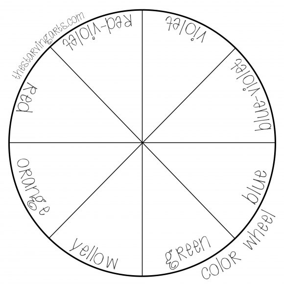
Want to practice your colors? Here’s a few blank templates to mix colors! Use any medium you’d like.
colorwheel

The last important aspect you’ll want to know for grasping the basics is a thing called perspective, or proportions. I’ll show you a simple exercise too to go along with it in this post. Hooray exercises. They do you good. Which reminds me I need to go to the gym. 
This post will be fairly short simply because there’s not a lot to talk about—not because I need to go to the gym.
 
Perspective is important, not only when painting or drawing something like a landscape, but also with portraits. It’s something you see every day and probably don’t realize it (unless you’ve taken my advice and been observing the world around you lately).
Komehakubutsukan-passage
 
In this example, it’s not something you really need to practice over and over (unless you want to), but it is important to understand.You’ll end up “practicing” it anyway.
Basically, the closer an object is to you the bigger it will be and the further away an object is, the smaller it will be.
Hendaye_école_de_surf_2012

There’s not much to say on this topic so I’ll jump right in to the example. We’re going to be drawing a “one point perspective”. You’ll need a pencil or pen, a ruler, and some paper. (Why this picture uploaded sideways on here I don’t know…)

Start by drawing a dot in the center of the paper (I drew mine kind of large) called the “vanishing point”, and then draw angled lines that intersect at that dot:
 
Note: I forgot to add in the “horizon line” (which is exactly what it sounds like). You’ll want to draw a straight line across the paper using your ruler after drawing the dot and THEN moving on to the next step.

Like this:

Now draw the lines:

 The finished product should look like this (just pretend I drew the horizon line).
 
  Note: They can be at any angle, I just drew mine like this.
 
Then draw lines perpendicular to the lines you just drew, like this:
 
After that, you simply mirror the bottom lines on the top. It should look like a big bow. Don’t worry about having them the exact same angle, or if it’s crooked or something. Precision isn’t important right now.


Now here comes the fun part, you can add any details you’d like. Just remember that any object closest to you will be the largest, and the further away it is, the smaller it will be. In my case, I just drew lines which get farther apart the closer they are to you (the viewer). You can draw anything you’d like.
 
Here’s another example (the perspective isn’t quite so distant):


This is the best way I can explain it. If you take the time to observe whatever it is you’re drawing or painting, you’ll automatically know this. It’s probably one of the simplest things to learn when you’re a novice. This was a fun doodle to draw when I was a kid, because I could make just about anything with it. Rooms, streets, tunnels, etc. Just have fun with it!

Want some homework? Do research on some perspective drawings other people have done. Try a Google search, you’ll find some pretty nifty sketches. 

Before I end this post I’d like to let you know that I’ve kept this kind of watered down because I want you to be able to envision it first. If you’d like a more detailed lesson on this, or anything else, just let me know in the comments!

Now I want to talk about how important shading and light is to sketching and, well, just about anything really. Not just sketching. This is probably going to be one of the most important blog posts you’ll read on here.

I’ll give you another exercise, a simple one, that I learned myself at a young age. Remember studying objects? You’ll need to do that again. Actually you’ll always need to do that.

If you were intimidated at all with the photo I posted in the previous post (or intimidated at all with getting started), this is the thing for you. I’m going to attempt to explain to you how to understand the shapes you are observing and studying in the world around you. As well as to focus on lighting and light sources.

First, try really simple shading (if you’ve never done this before you’ll need to learn this first). Take your pencil (any pencil) and start drawing on some paper. Start by pressing firmly (not too firmly or you’ll break the pencil lead) and, moving in a sweeping, back and forth motion (like coloring with crayons), gradually lessen the pressure as you go across the page. It should look something like this:


You’ve successfully learned shading! Yay! Remember to practice this first until you feel comfortable with it. Note: Don’t go back and forth in different directions. Try to keep the motion going in one direction or it’ll look messy.


Don’t make it uniform either, make sure you’re going from dark to light (or light to dark).


Now that we’ve got that down, here’s a simple exercise to help you apply what you just learned:


Simply draw the shapes above in the picture, like I did. If you feel more comfortable using a ruler you can. They don’t need to look perfect. Then add this:


That is your “lamp”. Now, the placement doesn’t really matter (or what it looks like), but, to save yourself some confusion, you may want to place it exactly how I did in this example.


The lines I just drew represent the light coming from the lamp.

Next, you’ll need to add shadows to each shape.


Now this is where it can get complicated. You’ll need to place them based on where the light source is. You’ll want to place the darkest shadows on the opposite side (for my example it’s the bottom right). Then, gradually make it lighter all the way towards the source of light. Remember to wrap the shadows around the shape of the object. For example, the sphere is not flat, so don’t use straight lines while shading—make them curved.

Need a better visual? Set up a real life example of this using a lamp or a flashlight you have around the house. Place random objects under the light and observe where the shadows are.

If you want to get real advanced, take into account the texture of the object too. Is it shiny? Does it have a matte surface? These will all reflect light differently. In addition, the height of an object, as well as the placement of the light source, will have an effect on the shadow the object casts.


Clear as mud? Great. You’ll want to practice this quite often. Take note that you won’t actually draw a lamp in every sketch. But for practice, if it helps you visualize where the light source is, feel free to draw it.


You must not only be comfortable with light and shadows and shading, they must become second nature to you. It’s vital to just about any medium and subject of artwork. You can apply this with what I said in my last post about drawing what you see.

Remember to keep yourself motivated, this takes a lot of patience and perseverance. I’ve known several people who took one look at this example and immediately were put off by it. Don’t give up! If you are genuinely eager to learn, you’ll be able to do it.
Stay tuned for more next week!